Plotly is an amazing interactive and open source library for data analysis that supports over 40 unique chart types covering a wide range of statistical, financial, geographic, scientific, and 3-dimensional use-cases.
In this article, we are going to present how we can color specific areas on the graph according to the field’s value inside our data frame.
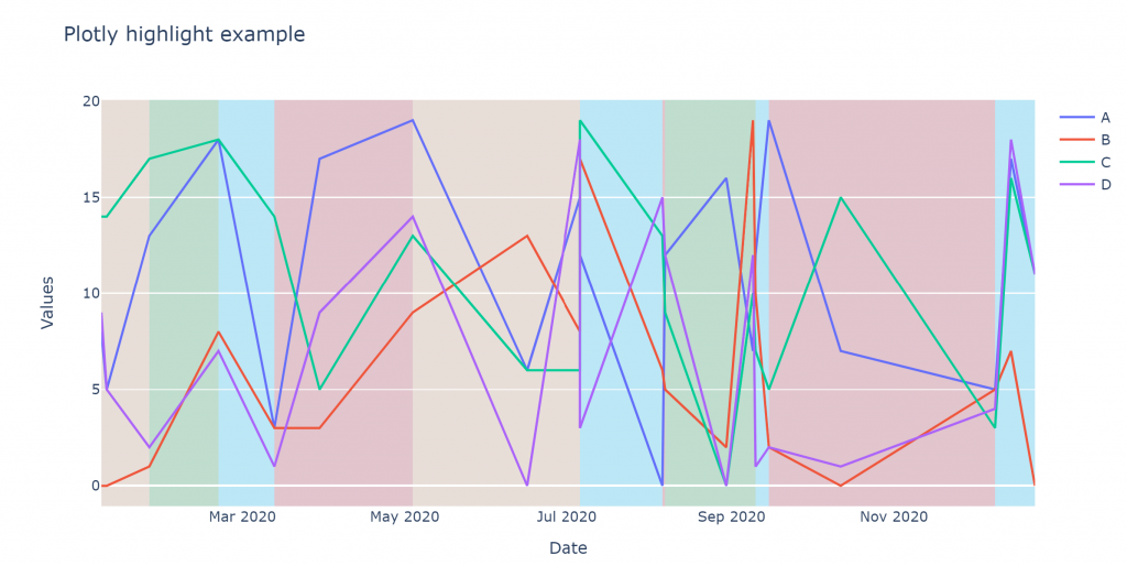
The result will be as the below image:
The first step is to install the necessary libraries:
pip install plotly
pip install pandas
Then will color the graph according to the status of the event_type column, using rectangular shapes.
     A   B   C   D       date     even_type
19  11  11  13   2 2020-01-02  acceleration
18   1  19   9  11 2020-01-08         start
12   7  12  17   6 2020-01-14       braking
11  16   6   1   2 2020-01-21          stop
9    2  19   6  17 2020-02-06  acceleration
14  10  13   7   4 2020-04-12  acceleration
16  18  11  18   9 2020-04-15          stop
17  12  17  19   9 2020-04-21         start
0    5   8  19   1 2020-05-10  acceleration
fig = go.Figure(data=[
go.Scatter(x=df['date'], y=df['A'], name="A", text=df["even_type"]),
go.Scatter(x=df['date'], y=df['B'], name="B",text=df["even_type"]),
go.Scatter(x=df['date'], y=df['C'], name="C",text=df["even_type"]),
go.Scatter(x=df['date'], y=df['D'], name="D",text=df["even_type"])
])
# Highlight areas according to the even_type
current = ''
changes = []
for ind in df.index:
if current != df['even_type'][ind]:
current = df['even_type'][ind]
changes.append([df['date'][ind],df['even_type'][ind]])
color_dict= {
'stop':'#d62728',
'start':'#2ca02c',
'acceleration':'#19d3f3',
'braking':'sandybrown'}
for i, val in enumerate(changes):
if (i+1) == len(changes):
changes_last_date = changes[-1][0]
changes_last_state = changes[-1][1]
last_date= df['date'].iloc[-1]
fig.add_vrect(
x0=changes_last_date, x1=last_date,
fillcolor=color_dict[changes_last_state], opacity=0.2,
layer="below", line_width=0)
else:
if changes[i][1] =='start':
fig.add_vrect(
x0=changes[i][0], x1=changes[i+1][0],
fillcolor=color_dict['start'], opacity=0.2,
layer="below", line_width=0)
if changes[i][1] =='acceleration':
fig.add_vrect(
x0=changes[i][0], x1=changes[i+1][0],
fillcolor=color_dict['acceleration'], opacity=0.2,
layer="below", line_width=0)
if changes[i][1] =='stop':
fig.add_vrect(
x0=changes[i][0], x1=changes[i+1][0],
fillcolor=color_dict['stop'], opacity=0.2,
layer="below", line_width=0)
if changes[i][1] =='braking':
fig.add_vrect(
x0=changes[i][0], x1=changes[i+1][0],
fillcolor=color_dict['braking'], opacity=0.2,
layer="below", line_width=0)
fig.update_layout(xaxis_title="Date", yaxis_title="Values", title='Plotly highlight example',xaxis = {'showgrid': False}, yaxis = {'showgrid': True})
fig.show()Source here: https://github.com/atheo89/plotly-highlight-areas-tutorial/blob/master/plotly%20tutorial.ipynb